Leeds and the Thousand Islands Public Library - BRANDING
Our logo is an important asset for representing who we are in the community. We use it to maintain consistency with out messaging and show that we are aware of the outward facing promotions and programs shared and created by the library.
Branding
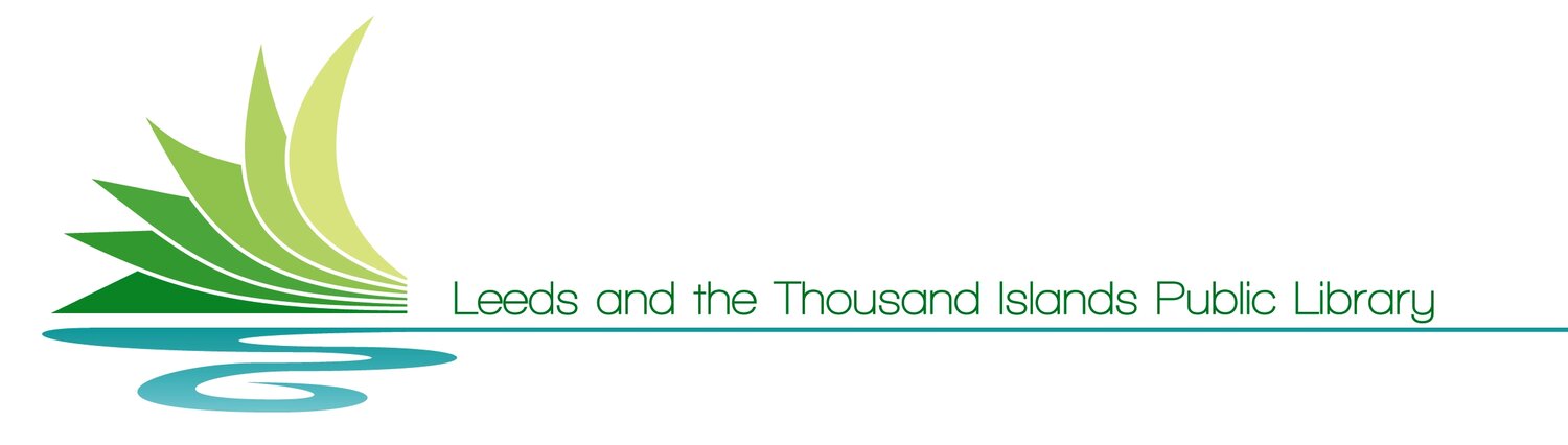
Our logo represents the large amount of flowing waterways in the 1000 Islands region and the lush landscape that surround us. The logo can be interpreted as the pages of a book and the knowledge that comes from it represented by the water flowing below.

Logo Colours
Our primary logo uses the following colours:

#0BB259

#B9D989

#44C2C2
Logo Colour
Logo Usage
Logo minimum size
The minimum logo size for digital application is 32px. The minimum logo size for print is 16mm. These numbers are chosen to keep the logo clear and legible.

#86C879

#E8EEAE

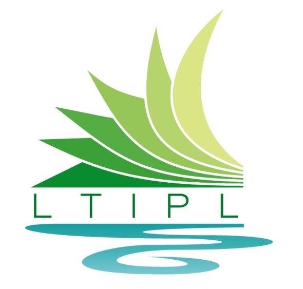
The compacted logo should be used whenever possible. It allows for a quick branding and can be adjusted to fit over many different images, backgrounds, and more. Some examples are:
You can also use the logo in either a full black or full white style. These options work great for more complex backgrounds and reduce the need to modify images, like the above. Some example include:

Logo clearing space
Clearing space for the logo is at least half of the width of the logo and half the height. These restrictions keep the logo clear of obstacles and clutter.
#A1DADF